When walls talk
Exhibition Design Monacensia im Hildebrandhaus
When walls talk
Under the title “Maria Theresia 23: Biography of a Munich Villa,” the Monacensia metaphorically opens the diary of the Hildebrandhaus in a completely reimagined and redesigned permanent exhibition.
The exhibition tells the story of generations of individuals who shaped the house, of fateful encounters, hidden truths, and reveals a multifaceted narrative which reflects the destinies of people and the turbulent times.
A dynamic history is uncovered – individuals from 120 years are brought into focus
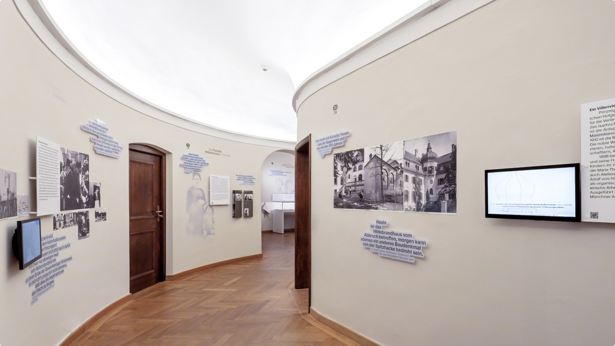
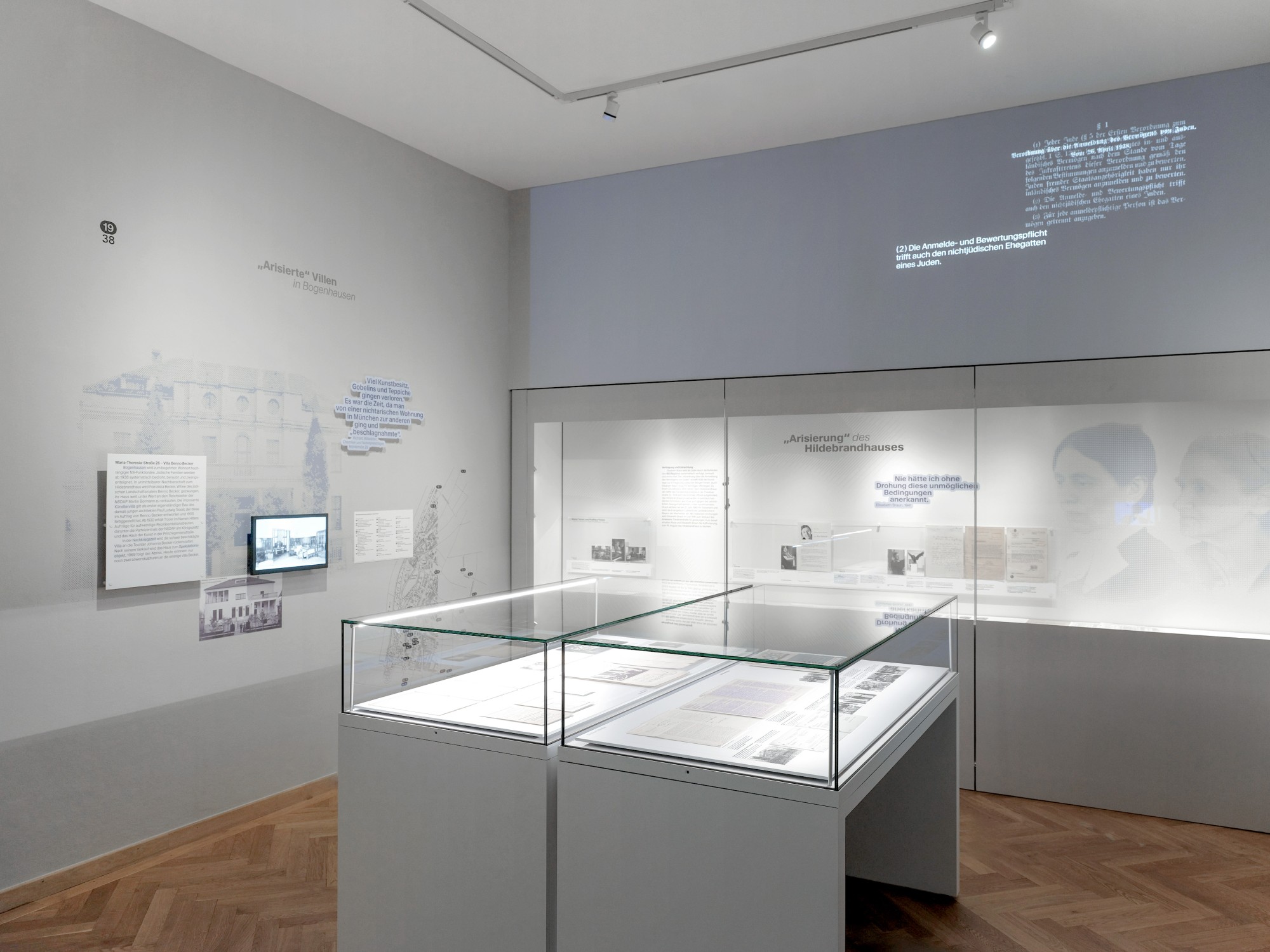
At the very start of the exhibition tour, visitors are greeted by the portrait of the house and various voices presented through quotations. The exhibition’s scenography unfolds across different narrative layers that build upon one another both thematically and visually, much like a wall that has been painted over multiple times across decades, revealing many layers. One of these layers is dedicated to the individuals who lived in and shaped the house.
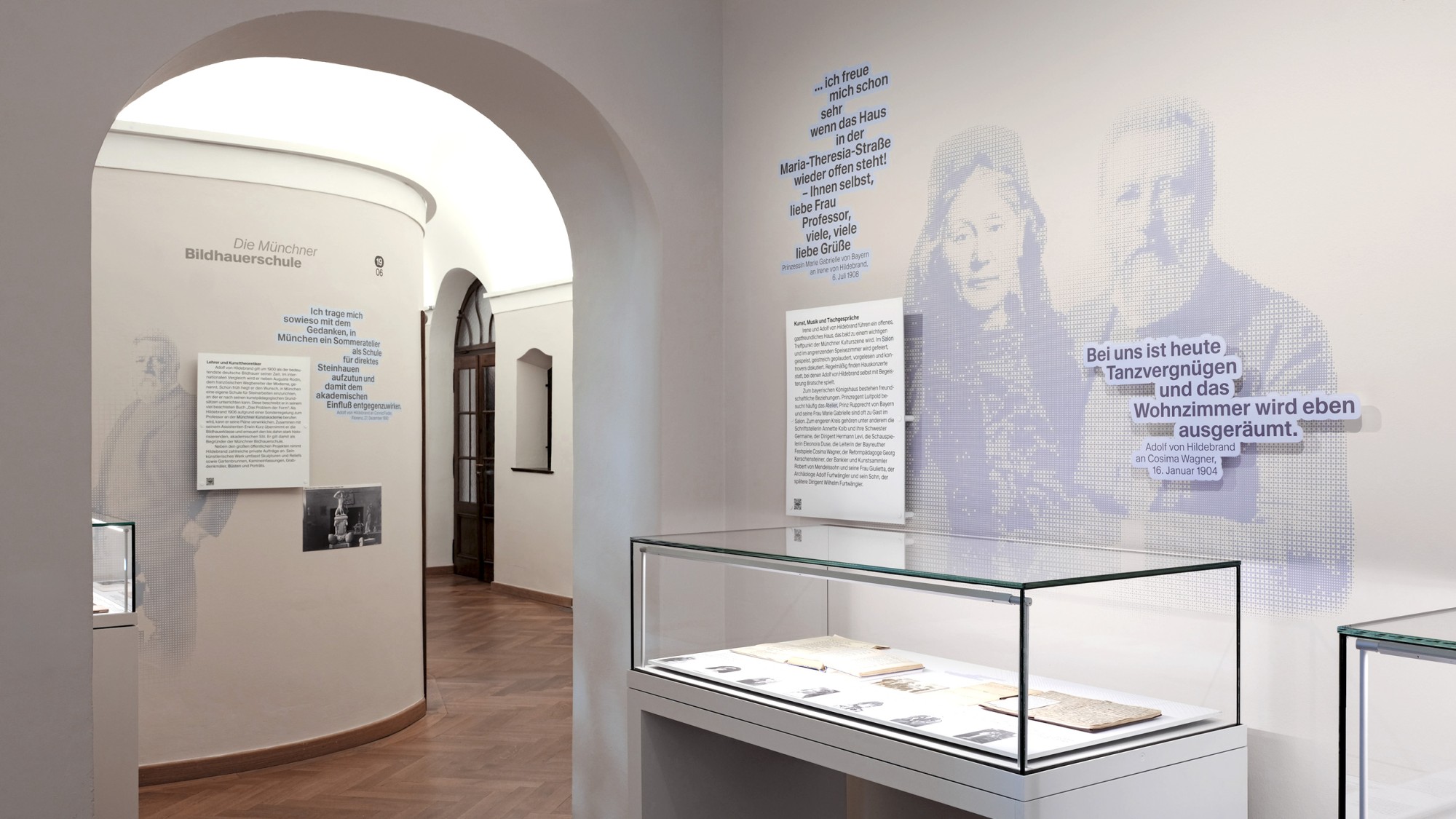
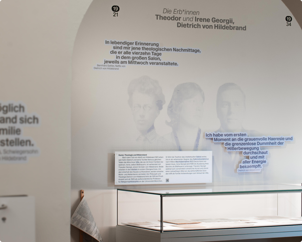
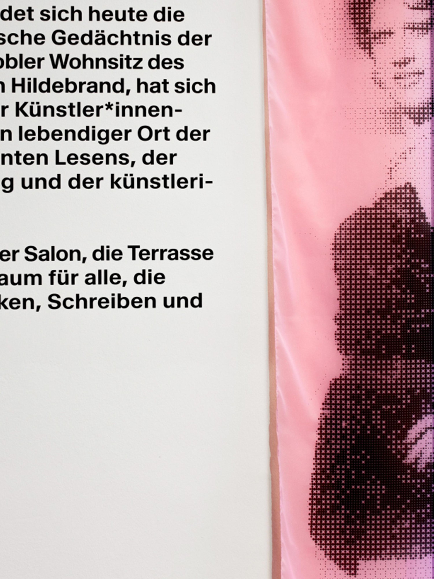
Their portraits are given space on the walls, where computer-generated rasterization and coloring strip them of their historical patina and visually transport them into the present—sometimes striking, sometimes documentary, and occasionally with gaps. These rasters condense, dissolve, sharpen, and fade back into the wall. To authentically achieve this effect, a color printer was used to print directly onto the walls of the Hildebrandhaus. To give the walls a voice, the layer of quotations is staged as speech bubbles. Framed organically and with free line flow, they are applied directly to the walls or emerge from the wall to engage directly with the viewer.
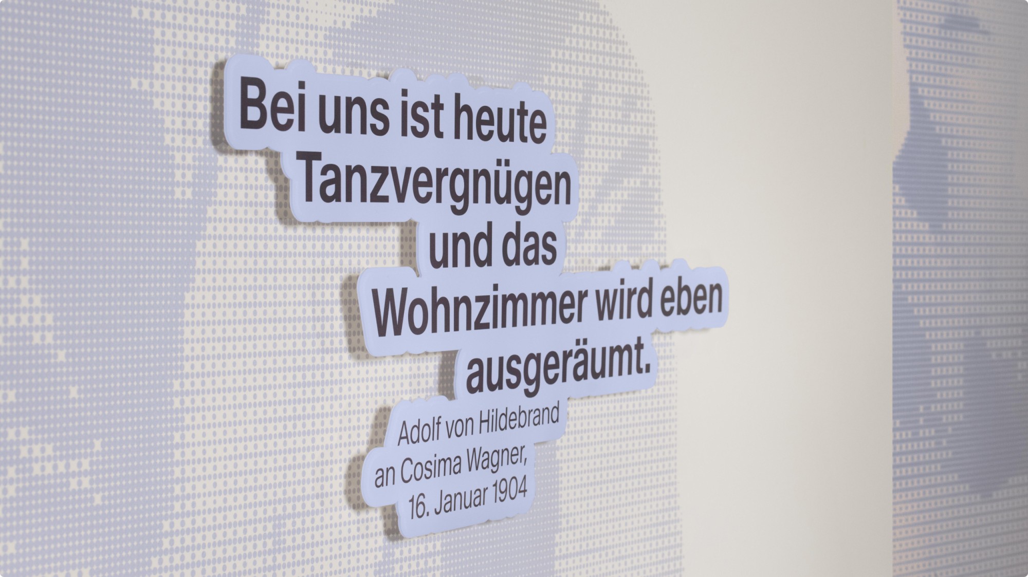
With clear words and letters
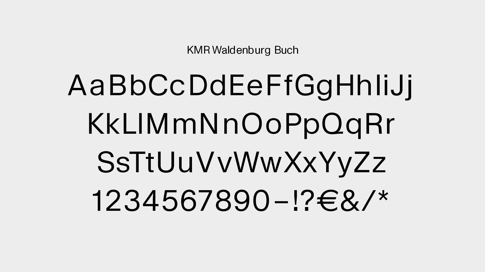
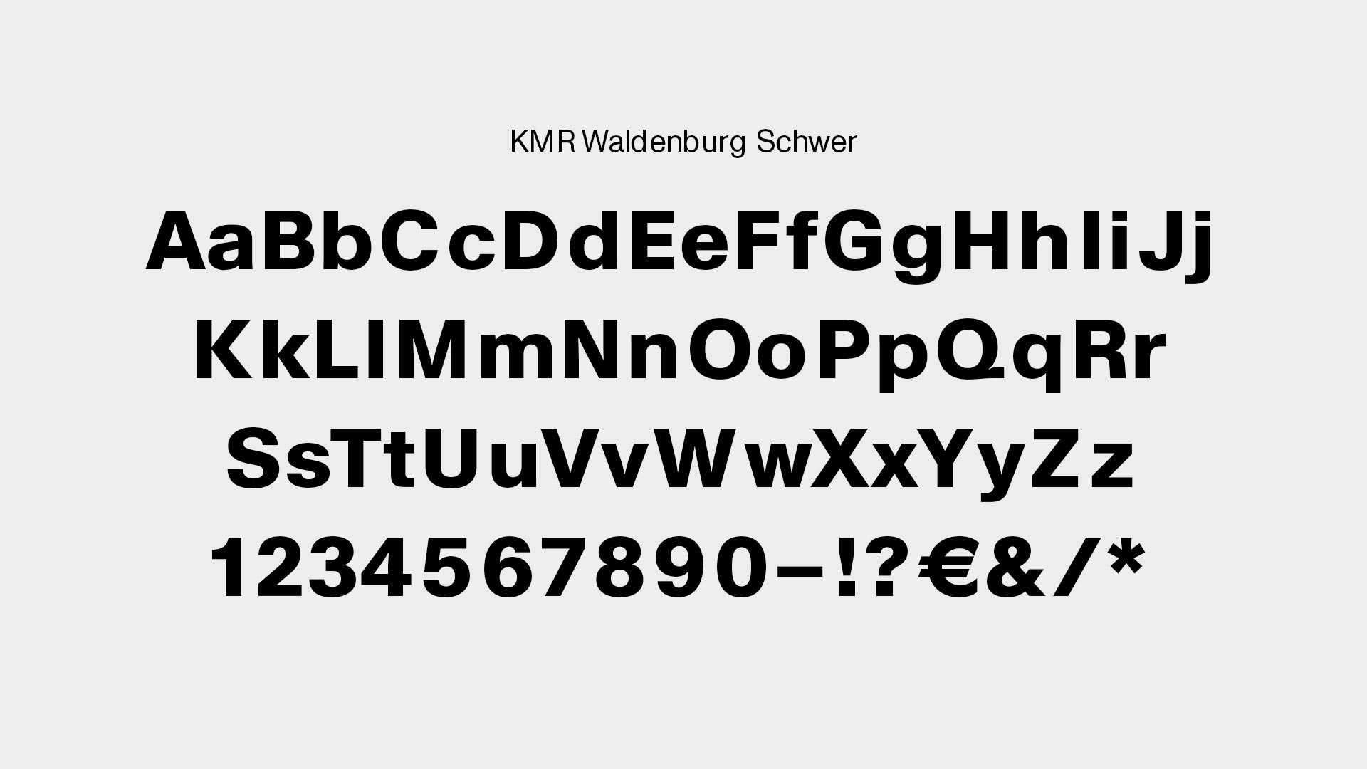
For the exhibition texts, the timeless, clear, and modern typeface Waldenburg by Munich-based type designer Michael Clasen was chosen. The font is used in various weights to clearly structure the texts and convey the content in an accessible and easy-to-understand way.
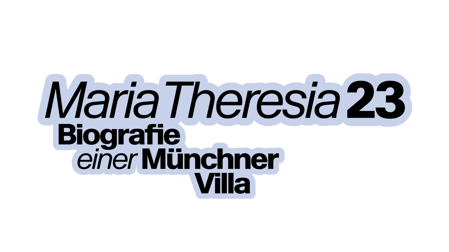
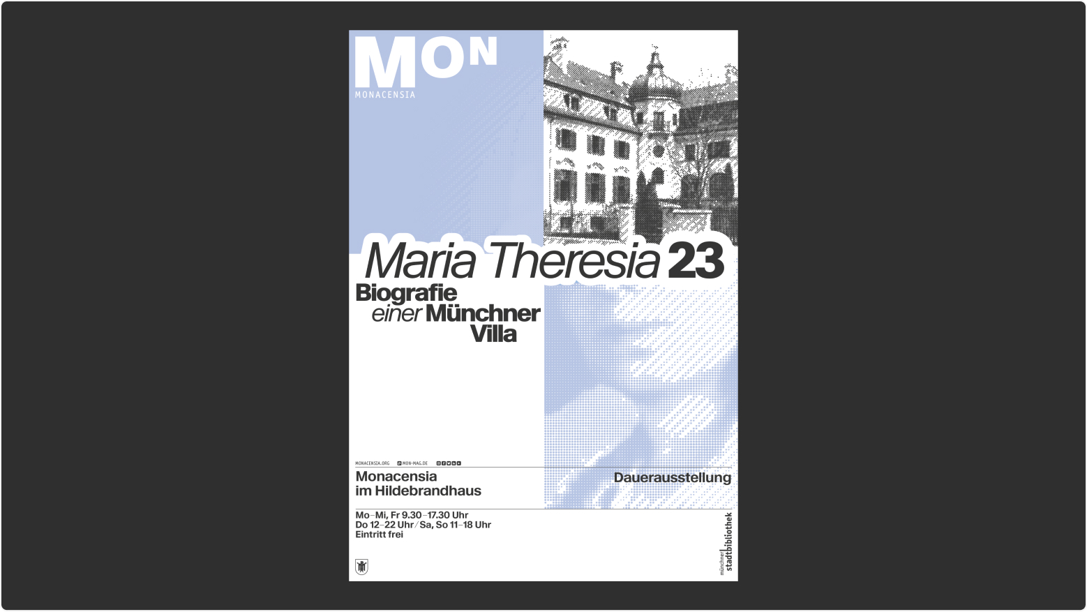
The arrangement of the texts follows a consistent line, ensuring that information is always found in the same place.
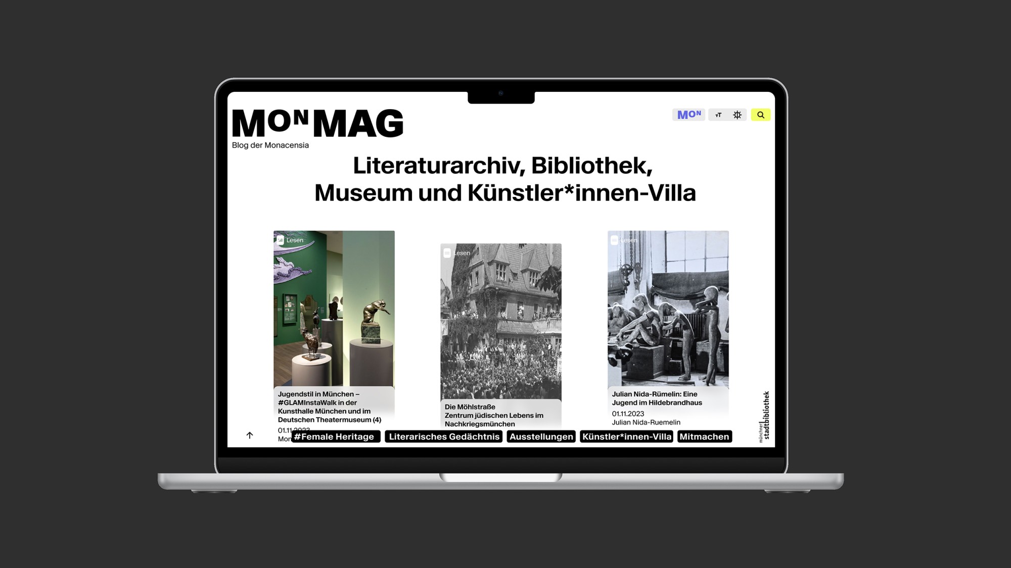
Further, deeper, smarter on MON_Mag
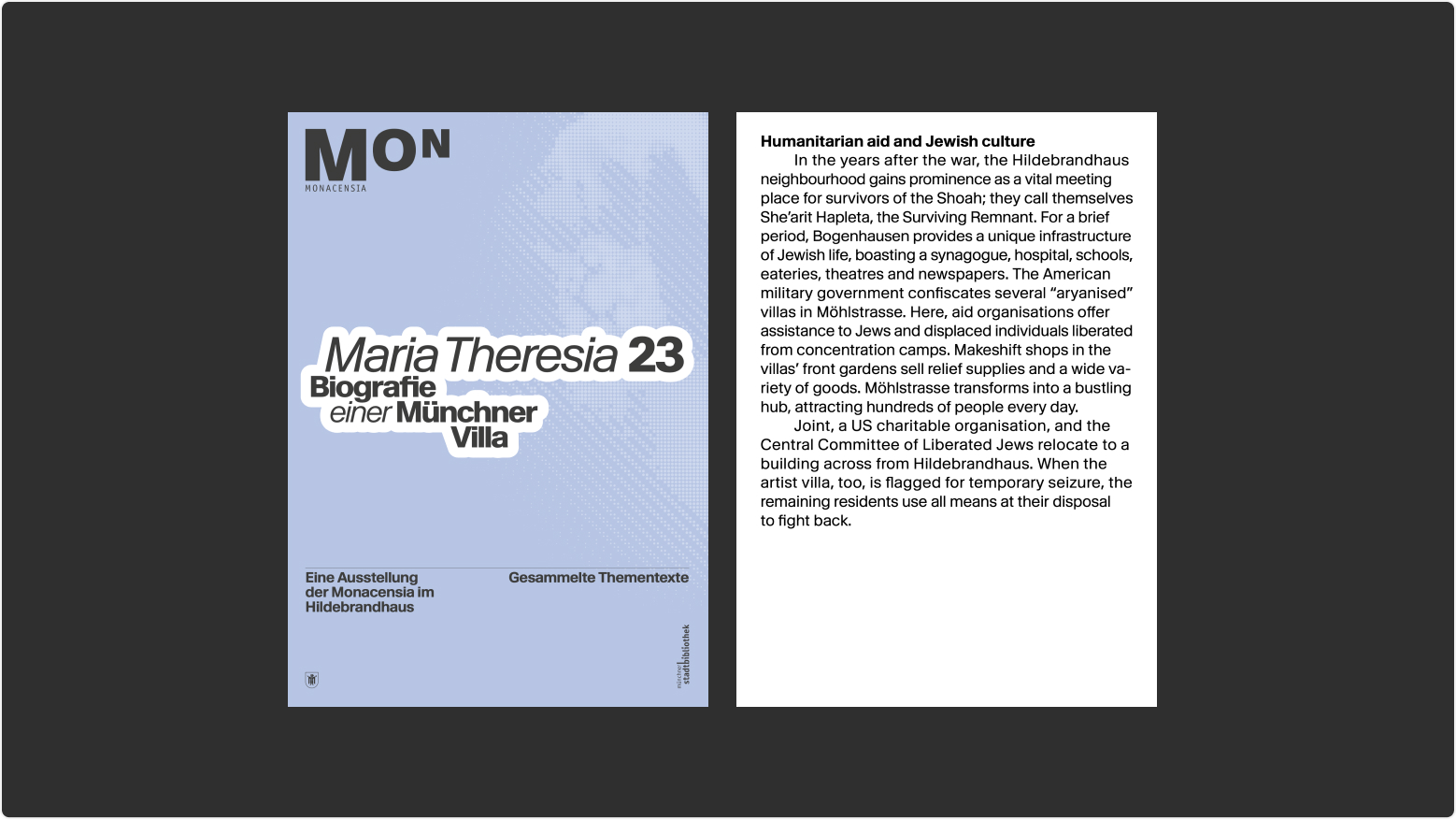
To dive even deeper into the topic, each station offers a digital layer that can be accessed via smartphone. These contents are part of the online magazine MON_Mag, which we designed for Monacensia as a central platform for the digital extension of the exhibition topics. Translations and transcriptions of video content can also be accessed through the digital platform. Markers within the thematic texts refer to the glossary, which visitors can take with them at the start of the tour. The glossary provides detailed explanations and context for key terms, allowing even those without prior knowledge to easily follow the content.
Systematically thought through and sustainably implemented
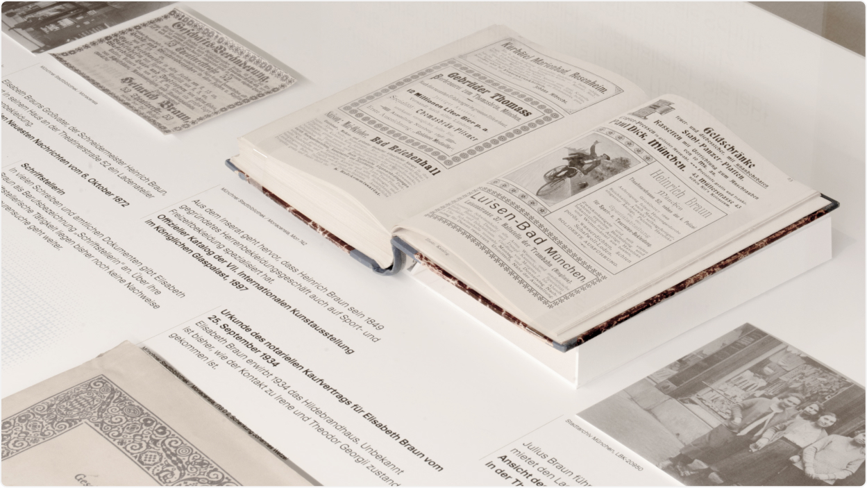
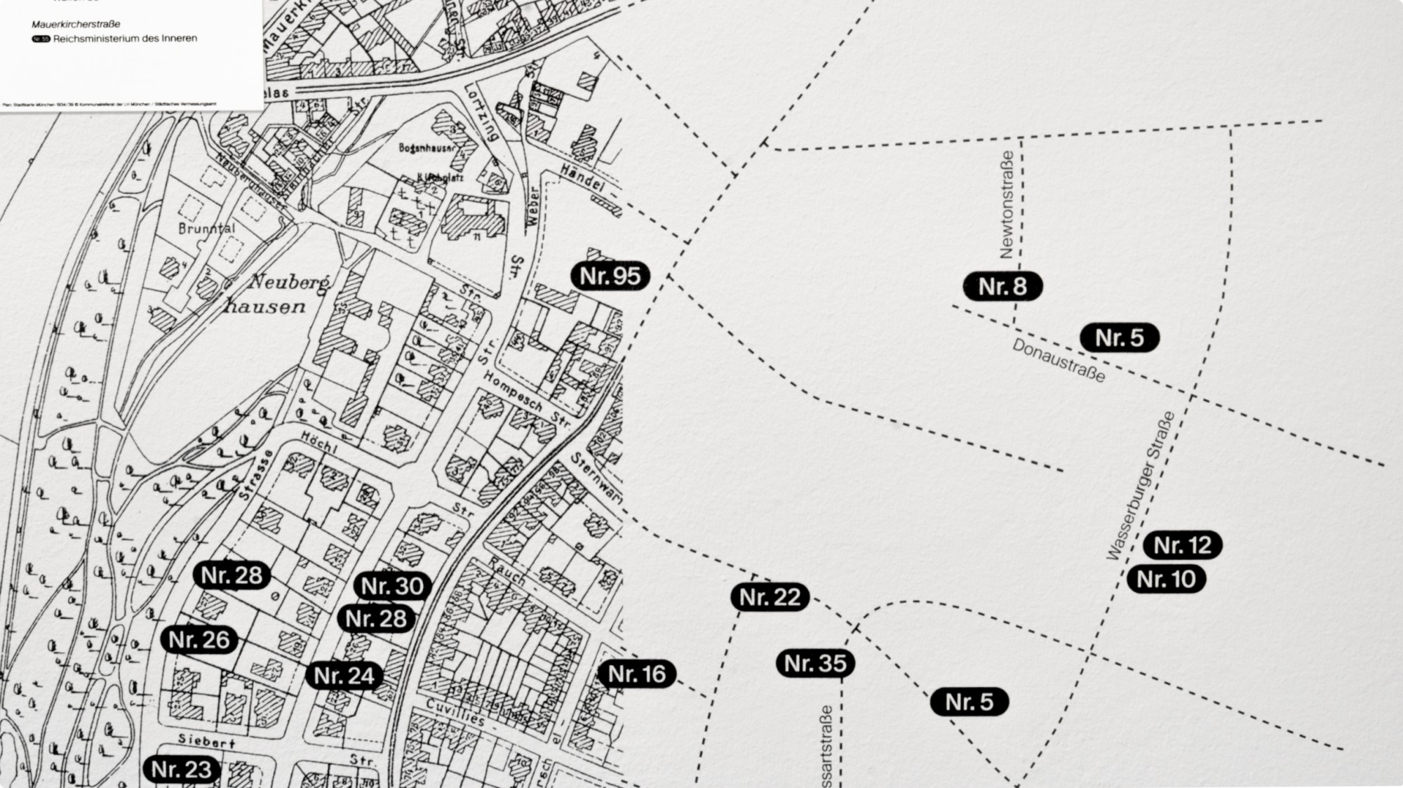
The wall design is based on a grid derived from the 16:9 digital aspect ratio. This results in all formats used in the exhibition, ensuring they are proportionally consistent with each other, including the monitors. By printing directly onto the wall, carrier materials were saved. To further conserve resources, the in-house display cases were refurbished and partially redesigned for the exhibition, rather than discarding existing materials.
And what happens today and tomorrow?
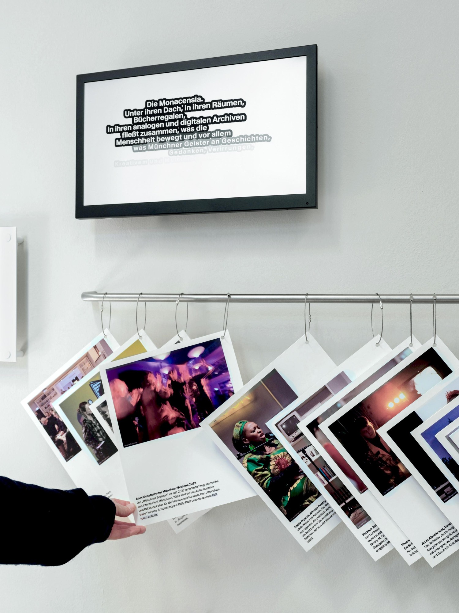
A part of the exhibition showcases the current work of Monacensia and therefore deviates from the design of the other rooms. Like index cards, text tiles with information about the ongoing activities at the Hildebrandhaus are displayed in a row on the wall. This system allows for a continuous expansion of the exhibition content and symbolizes the archiving and collection process of the house. Additionally, the themes of the space are visually organized with brightly printed fabric strips. The room design thus emphasizes the aspect of the artists’ villa – open, colorful, and diverse.
Nice to meet you
Work with us