Im Dialog mit einem Archiv
Exhibition Design Monacensia im Hildebrandhaus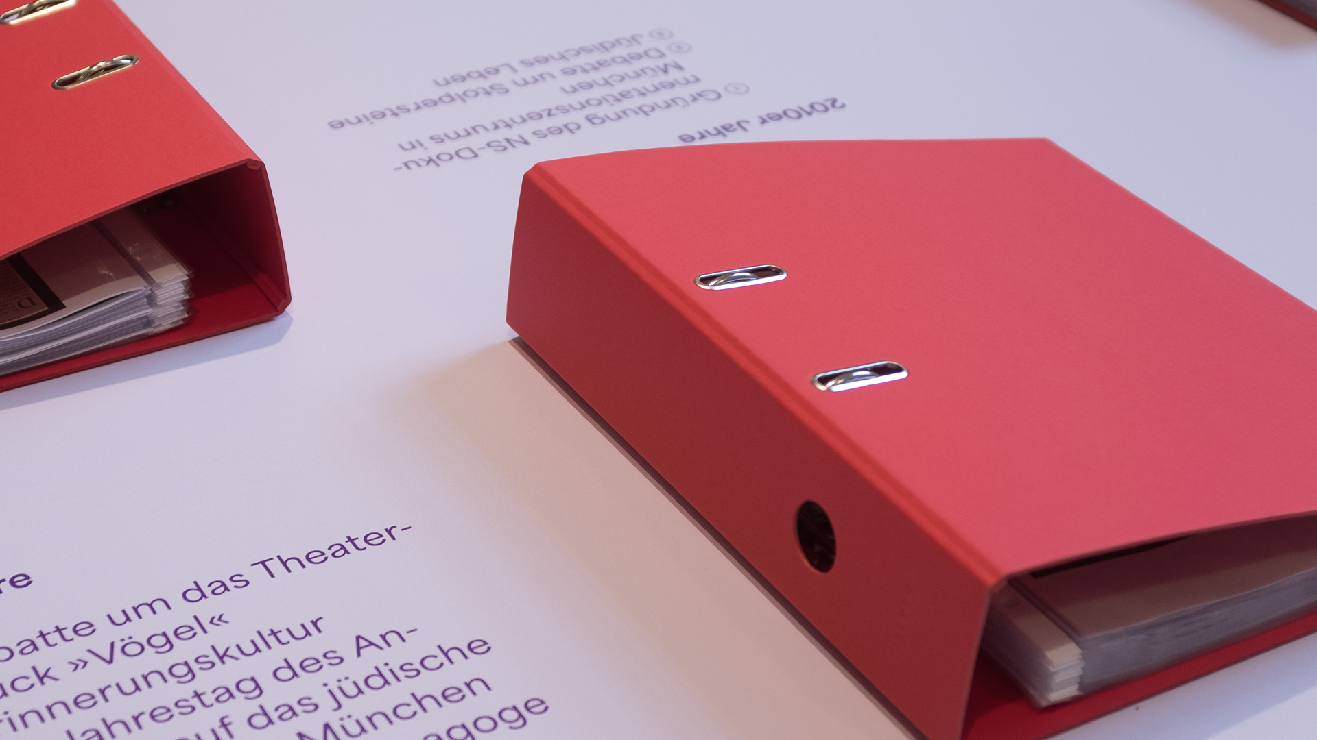
Im Dialog mit einem Archiv
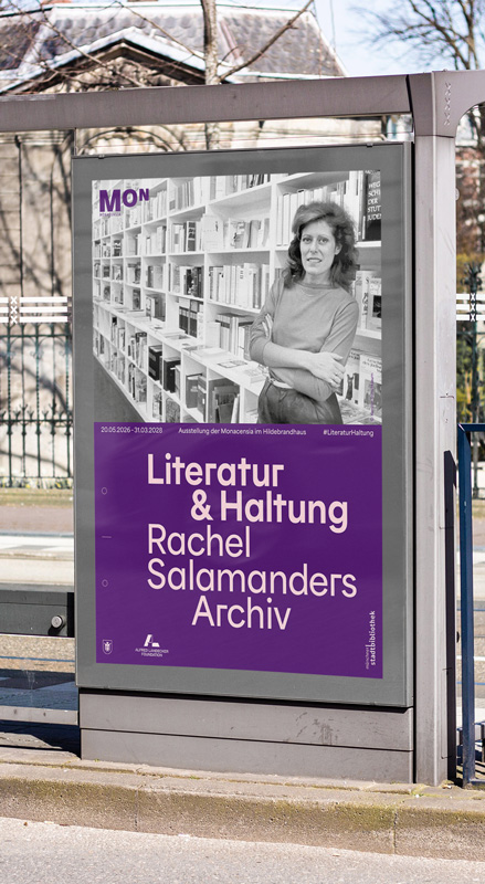
Under the title “Literature & Attitude: Rachel Salamander’s Archive,” the Monacensia presents Rachel Salamander as a writer, cultural mediator, and founder of the Literaturhandlung, while also providing a platform for the many literary voices she shaped and supported. The exhibition focuses on the beauty and expressive power of literature and language.
Literature as an Attitude, Powerfully Staged
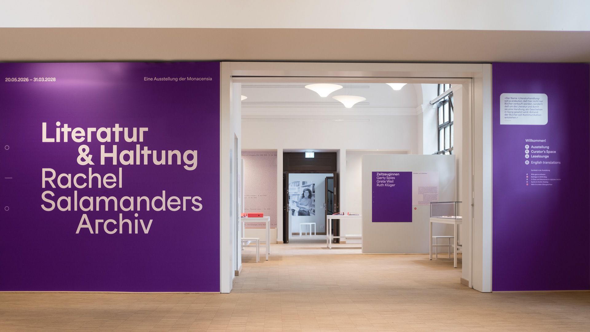
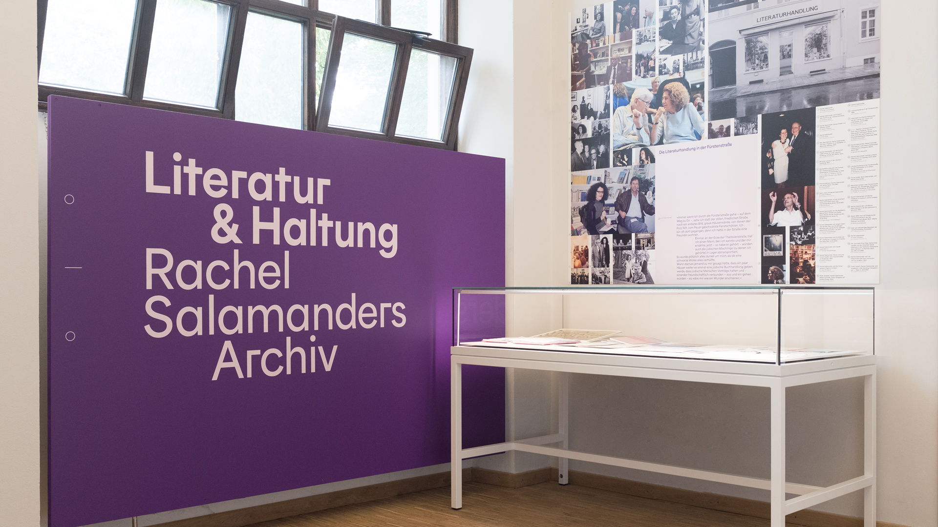
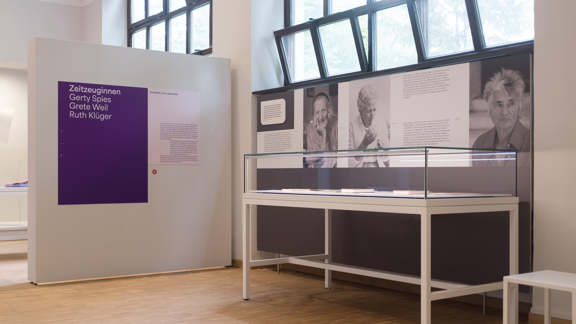
The exhibition design combines a clear grid with a distinctive visual language for the various levels. This spatial form is complemented by a unique color palette consisting of bold shades of purple, red, and gray, along with pastel tones of pink and lilac. The overall effect of these elements focuses on creating a powerful and emotional space to convey Rachel Salamander’s work, the literature, the authors, and the documentary material. Texts, quotes, exhibits, audio recordings, and film clips can be experienced both in a conventional and interactive manner throughout the spaces. Films, exhibits, and collected works invite visitors to immerse themselves and establish connections to the present.
A unique forum for Jewish authors
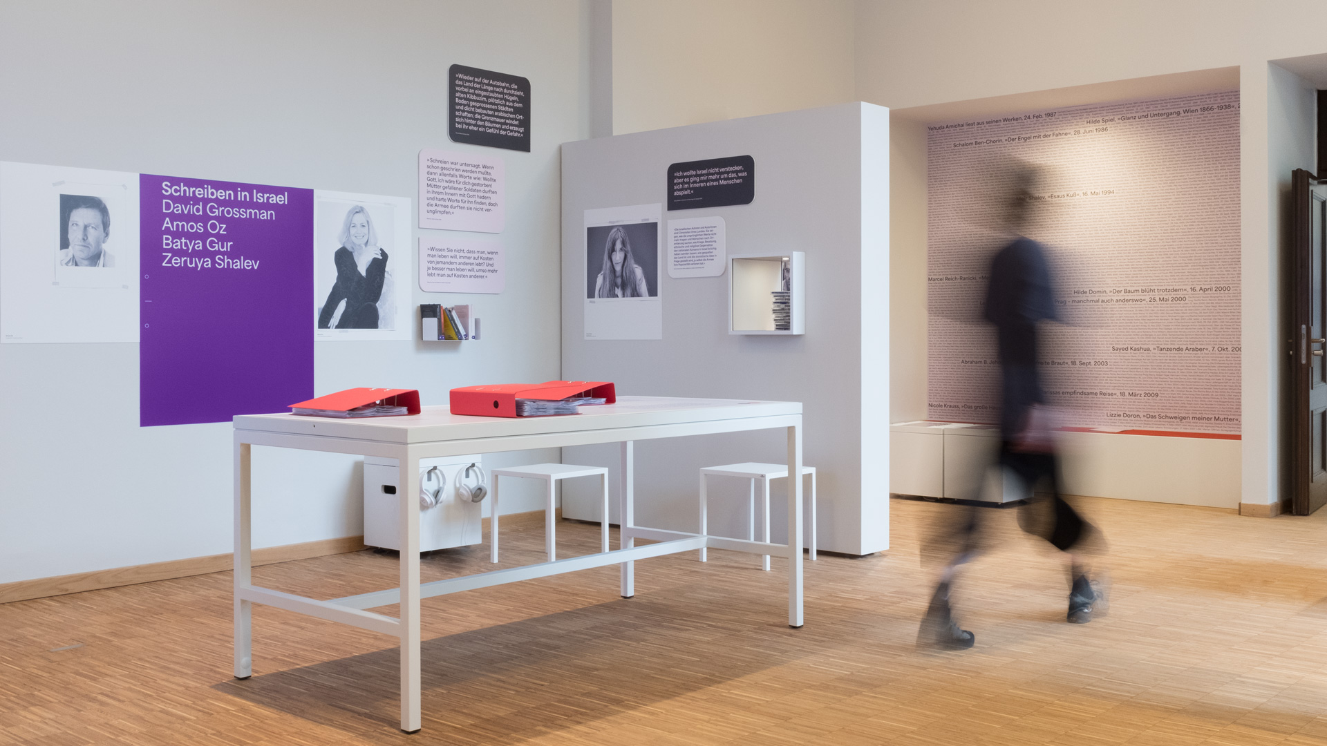
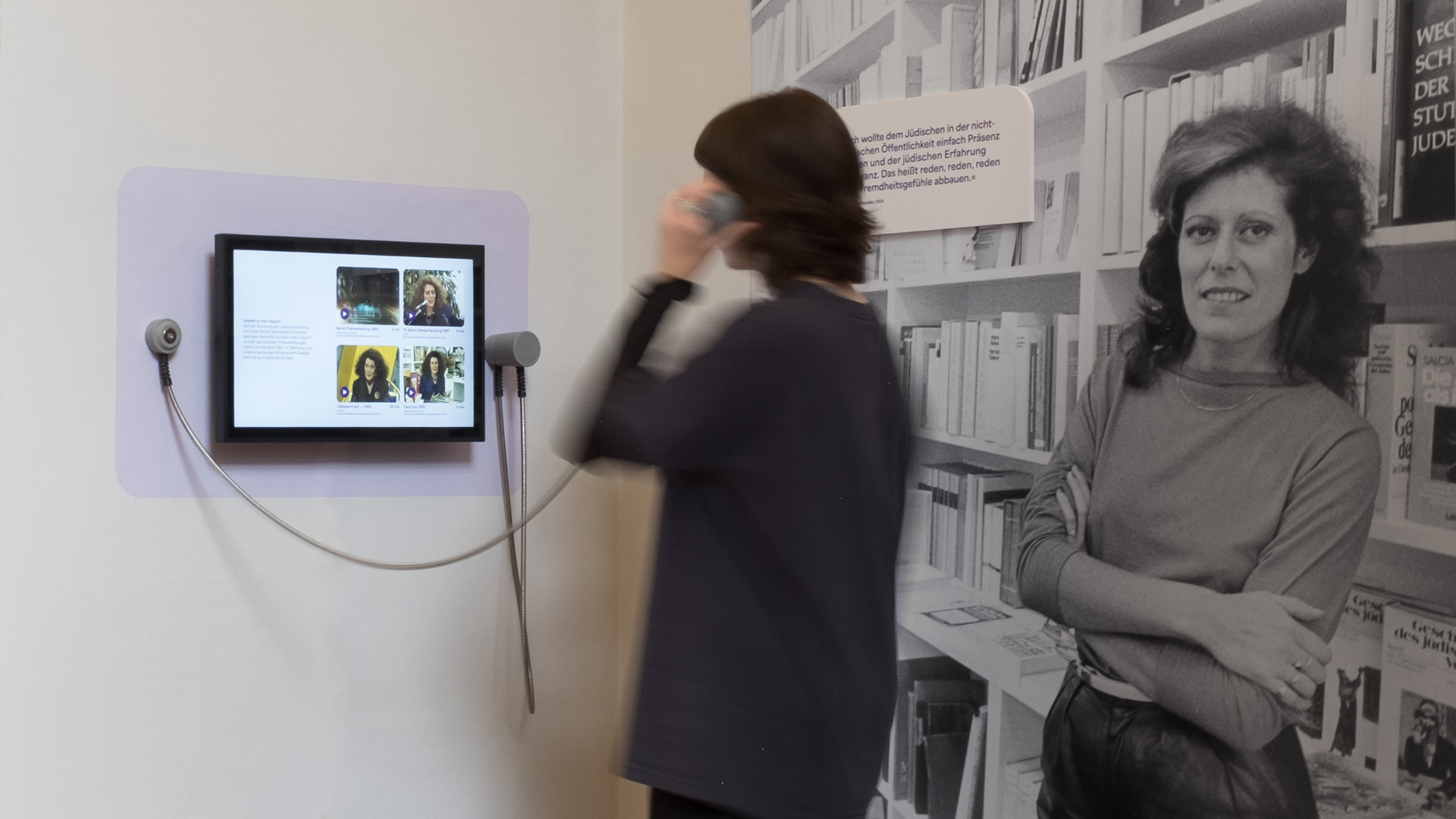
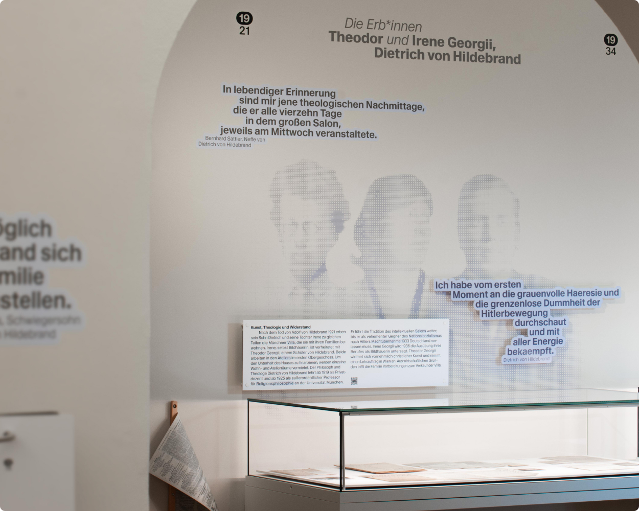
A central element of the exhibition is the design of the dialogues on the walls, which are composed of quotations. The quotations from various authors, combined with notes and comments by Rachel Salamander, are presented as simplified speech bubbles in the stylistic language of modern chat histories. The panels protrude three-dimensionally from the wall, thereby illustrating this unusual form of conversation developed by the curators.
Multi-picture tableaux depict a selection of the sheer countless events that Rachel Salamander has organized and shaped. In the exhibition’s alcove, even more space is devoted to this theme: the sheer density and abundance of the list on the wall immediately make it clear what an extraordinary life’s work is documented here.
The Archive and the Bookstore as Sources of Inspiration
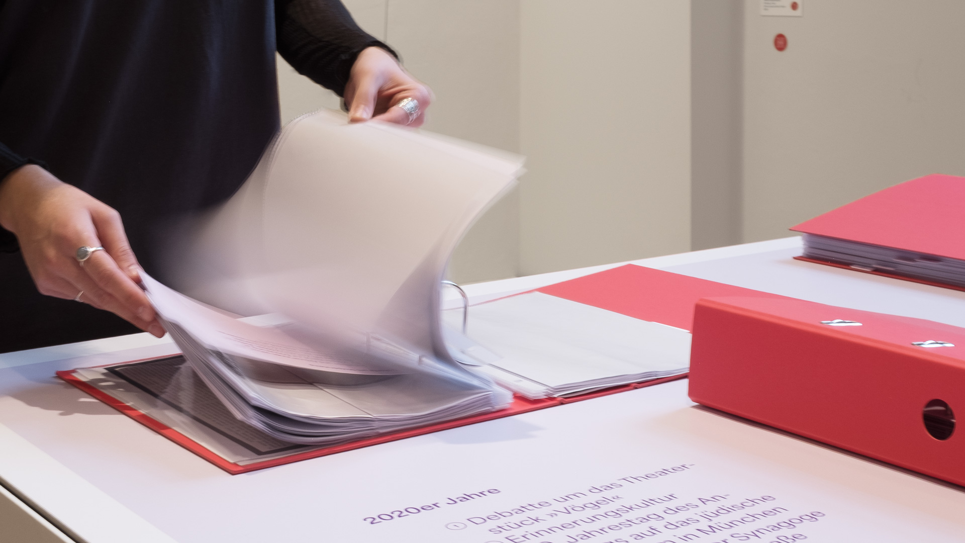
The visual language of the exhibition draws on Rachel Salamander’s actual archive. The iconic red folders in which she collected everything for decades, as well as punch holes, photocopied documents, divider sheets, and sequential numbering, are reflected as design analogies throughout the exhibition space. The portraits of the authors are designed to look as if they had been reproduced on a photocopier.
The innovative shelving system at the bookstore and the systematic approach used to present literature there inspired the spatial and visual organization of the exhibition.
The “Area” typeface from the French type foundry Blaze Type was chosen for the typographic design. The typeface draws inspiration from the distinctive typography that Rachel Salamander used for the book store, program flyers, and other printed materials, but reinterprets it in a contemporary style, thereby meeting today’s requirements for readability, functionality, and digital use. Drawing on classic book design, typical design elements such as indents and marginal notes are incorporated.
A New Space, Reimagined
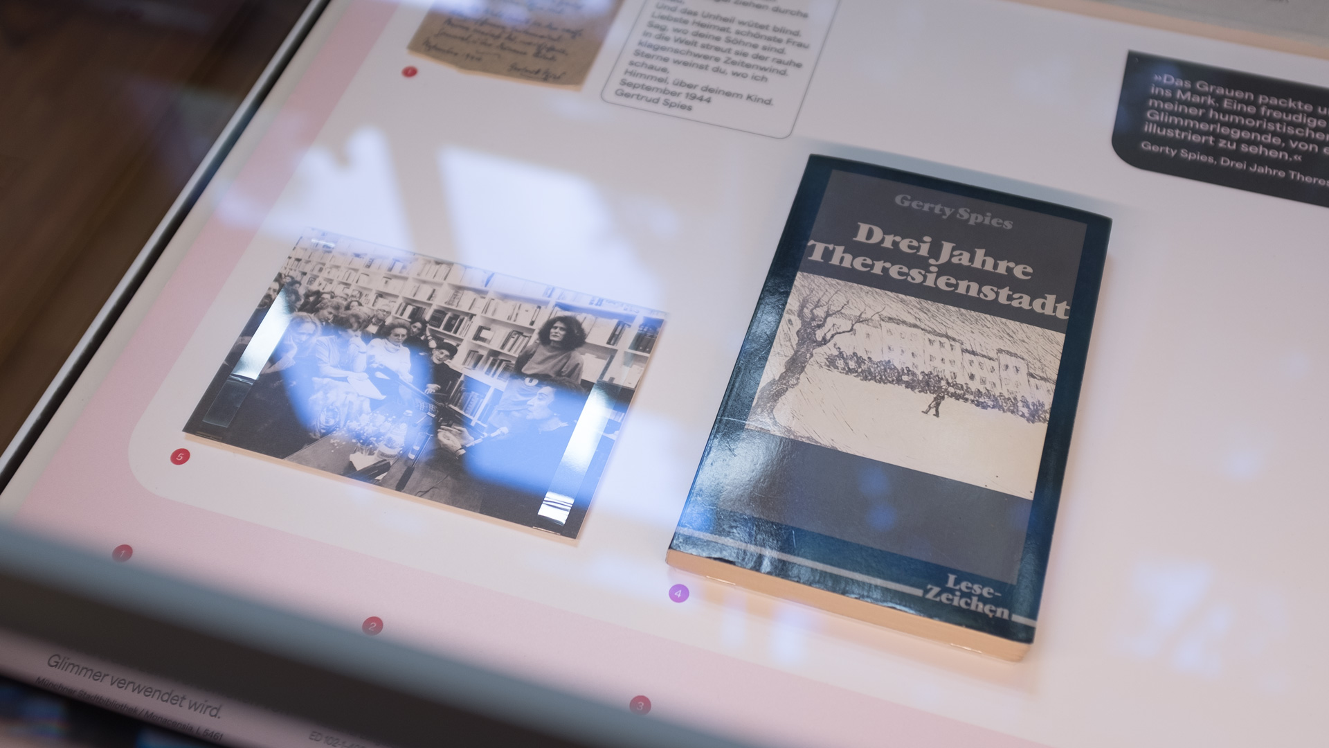
The Monacensia’s existing display cases have been redesigned so that they can also be used for future exhibitions. They feature documents from the Monacensia’s literary archive and the archive of the Institute for Contemporary History in Munich, photographs, manuscripts, and personal documents from Rachel Salamander’s archive, as well as a work of art by Miriam Salamander.
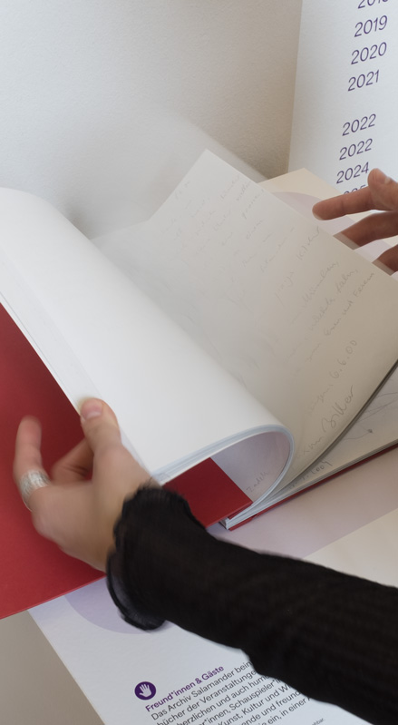
All interactive elements—audio recordings of readings, archival films, and film clips—are highlighted in color and marked with a “hands-on” sticker, making it clear at a glance what visitors are allowed to touch, listen to, and experience.
Take-away package: The exhibition to take home
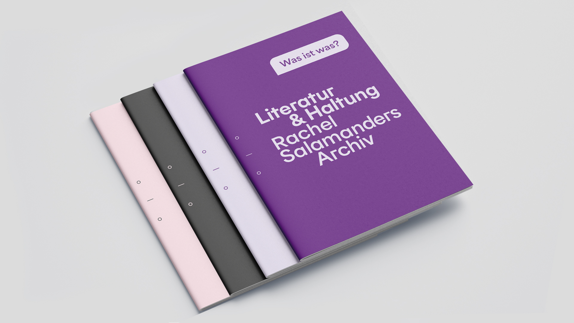
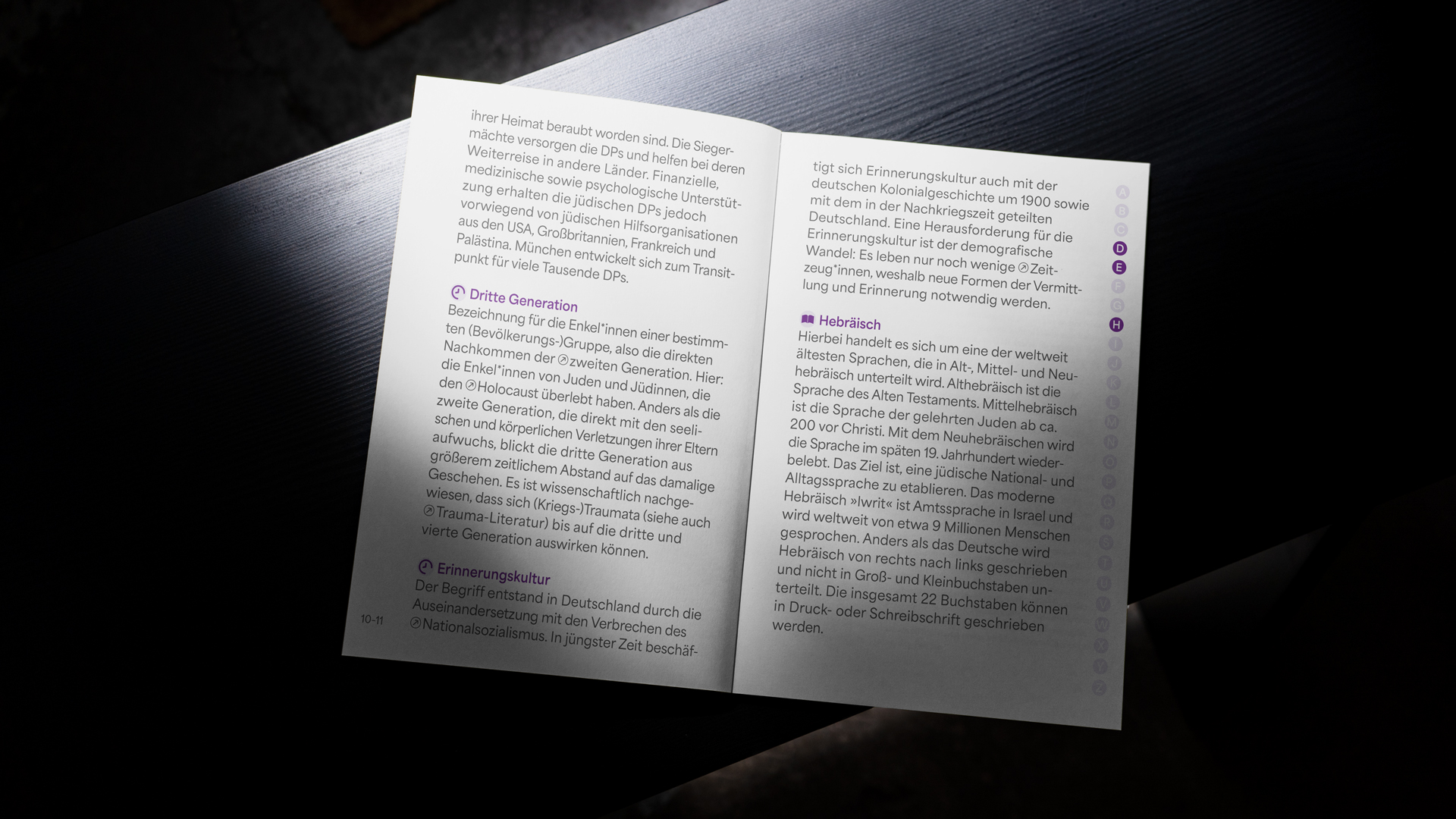
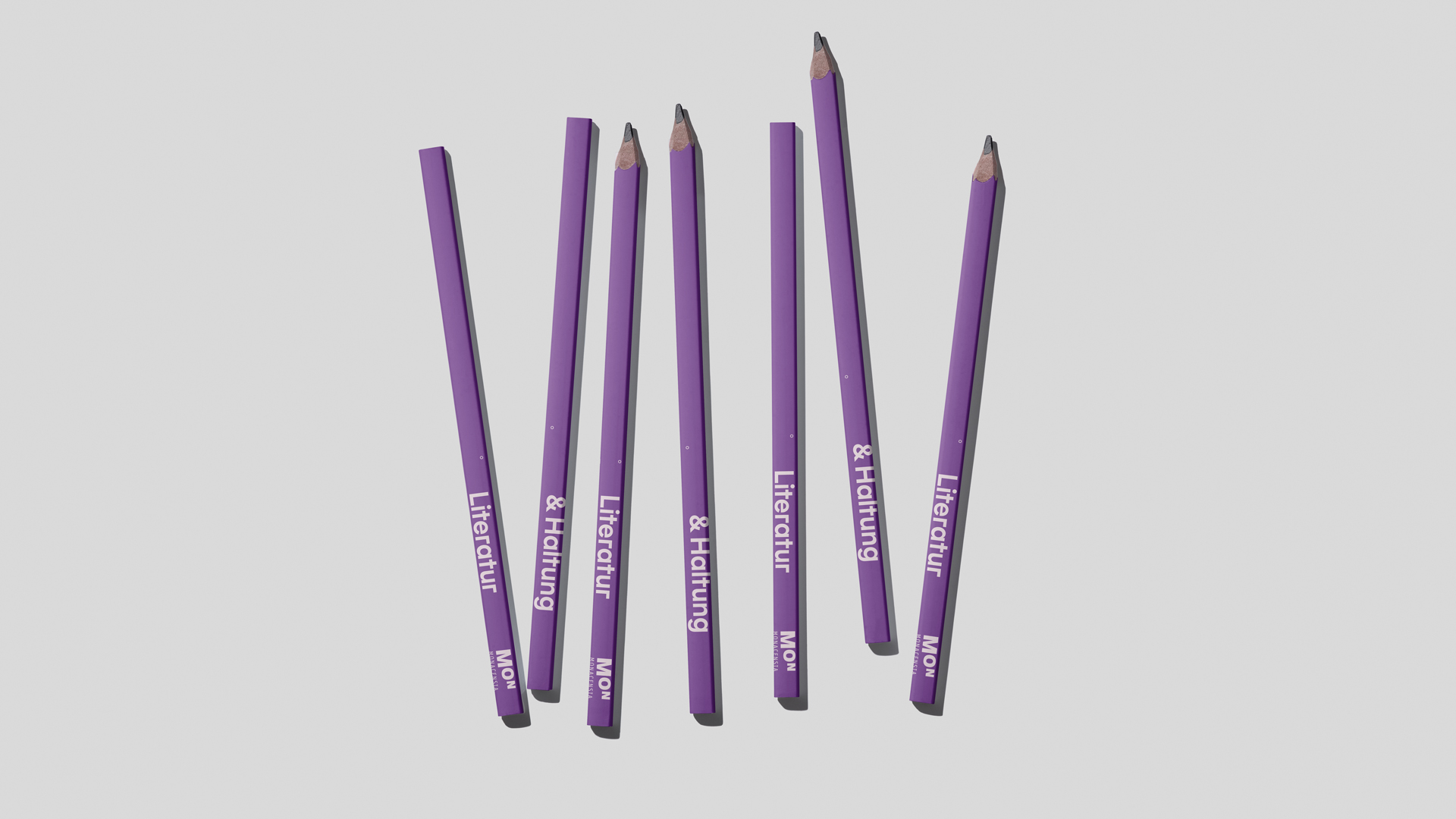
A small take-away package was developed and designed specifically for the exhibition. Held together with a rubber band to keep it compact, the package includes four DIN A6 booklets containing background information, a “To Go” summary, and space for notes. All materials feature the exhibition’s design and encourage visitors to reflect further on their experience and record their thoughts.
Dive Deeper on MON_Mag
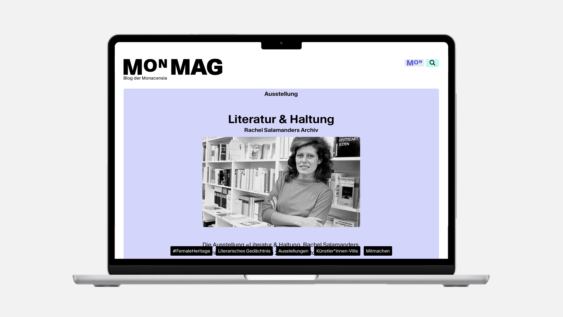
As with the Hildebrandhaus’s permanent exhibition, the MON_Mag platform designed by us is also being used as a digital extension for this exhibition. A new feature is the presentation of the exhibition content on the platform as a digital version in Pageflow.
Related Projects
When walls talk
When walls talk

History for today - Erika Mann, an important voice for democracy.
History for today - Erika Mann, an important voice for democracy.

Nice to meet you
Work with us